
A burn-down chart can use anything for the units, such as hours or points, but originally Scrum’s burn-down chart tracked hours of work remaining in the iteration. Many people still use an hours-based burn-down chart as their primary measure of progress during an iteration. That’s a useful tool, but it is similar to tracking yardage in an (American) football game. It measures activity, but not accomplishment. After all, what percentage of a touchdown is 30 yards?
Working Software is the Primary Measure of Progress
One of the principles from the Agile Manifesto is “Working software is the primary measure of progress“. But burning down hours is measuring and reinforcing progress against a plan without any requirement to have working software until the end of the iteration. That’s pretty much the same as not having to have working software until the end of a waterfall release! This is one of the reasons that many people have moved away from burning down hours or supplemented it with other tools, such as burning up story points.
Burning Up Points to the Rescue
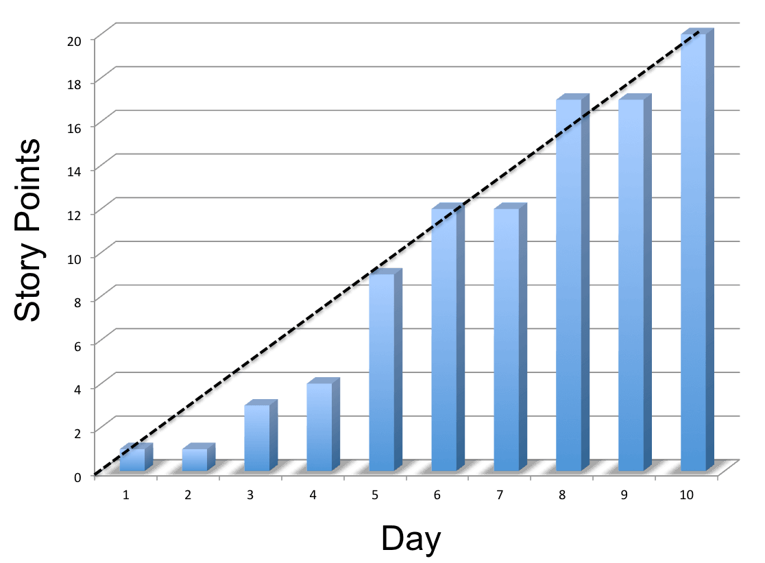
At the end of each day you tally up the story points associated with all of the stories that meet your definition of “done” and record the total on the chart. For instance, if you completed a 1 point story on the first day, nothing on the second day, and a 2 point story on the second day, your chart would have a 1 point bar for the first day, a 1 point bar for the second day, and a 3 point bar for the third day.
A points-based burn-up chart lets you see graphically day-by-day how much progress you are making towards your goal. It only records accomplishment, not activity, and allows you to see if you are on track or getting behind. To me, this is exactly what is meant by “Working software is the primary measure of progress.”
Won’t The Chart be Empty Until the End of the Iteration?
At first you may think that the chart will show that you are behind for most of the iteration and catch up only at the end when QA is able to start testing and marking stories as done, but whenever the chart shows something other than a steady march to the end of the iteration, here are some of the questions you should be asking:
- Are our user stories too big? Is that preventing QA from getting involved earlier?
- Are people working on too many stories at once?
- Are we unable to produce a stable build for QA to test?
- Are developers producing a bunch of problems and then going on to the next story instead of helping QA resolve the problem?
- Should the developers drop what they are doing and lend a hand writing automated tests?
- Use story points for estimation, it enables whole-team thinking such as this whole-team metric.
- Make stories as small as possible to get them done as fast as possible to keep the focus on accomplishment rather than activity
- Have as co-located and as cross-functional a team as possible to enable the fastest possible turn-around time on stories
- Enable the team to work as a team and to manage more things on their own